Grouping companies using data analytics
Interesting observations and phenomena become visible once we group companies.
When companies starting to pay dividends, they still go through their early growth cycle where dividends aren’t always paid, not always increasing, showing higher volatility - towards a very mature and stable company that pays consistent, sustainable, increasing dividends and showing less volatility.
But how do you see those stages?
By using measurements like average dividend, price, and earning growth rates over 5 or 10 years, along with risk, volatility, tradability, and return, we can identify distinct groups of companies. The economy influences the entire market, and therefore, a company's performances. Some companies will fall out of one group into another. Incoming tides lift all the boats.
Calculating the average of the measurements within each group uncovers hidden phenomena. We notice that the values from quality shares are higher than the group averages. Further, each group shows unique characteristics around volatility, risk, and return. If we calculate the risk/return ratio, we even notice which groups offer better returns for less risk, and which groups offer very high returns for high risk.
We can use these observations to create a portfolio that matches an investor's risk profile.
Can we do that in any stock screeners? It depends on what data is available, if you can program data queries in the backend and what exposure you have to the data.
Conclusion
The averages will vary with market conditions, but the relative relationship will stay the same. The assessment was done in March 2022, which was just after the recovery of the worst Covid and the first Omicron variant appeared, and the ASX reached a new peak.
10Divgrowth: Show which groups gave consistently the highest dividend growth shares over 10 years. In this case the Bluechips & Tightly held groups.
5Divgrowth: Show which groups gave consistently the highest dividend growth shares over 5 years. In this case the Favourites & Bluechips groups.
• BUT more important, which groups gives the worst dividend growth. To be expected, and as usual, these are the Maverick & Rising stars groups.
Volatility: When looking at the ASX200 over the same period, we noticed a very volatile market as the index shows high up and down movements. The group that shows the highest level of volatility, as expected and as usual, the Maverick group. When market conditions change, we expect that the groups with the least volatility to be the Favourites and Tightly group.
Market cap size: To be expected, the groups that have shares with the largest market cap are the Favourites and Tightly group. More important is the group, with the smallest market capsize, and, as expected, is the Maverick group.
Note that the remaining groups are closely similar in size and, therefore, on its own, the market cap size is not a unique indicator. You should use it with other patterns and attributes.
15PriceGrowth: As expected and over a very long time, the group that shows consistency is the Tightly group. As this group of shares is not highly available to trade, the demand increases, which increases the price. Having a high, average long-term growth doesn’t mean the highest growth over the past 10 or 5 years.
10PriceGrowth: As to be expected, the groups that have shares with the largest price growth over 10 years are Favourites, MidCaps and Bluechips groups. However, it doesn’t mean they will also have the highest growth of the past 5 years.
5PriceGrowth: As to be expected, the groups that have shares with the largest price growth over 5 years, are Tightly, then Maverick followed by MidCaps groups.
Earningsgrowth: The reader can observe similar patterns in the groups over 15, 10 and 5 years. The problem is as earnings increase; the share becomes a market darling, and the price gets driven up higher by investors. Therefore, it's better to look at the very short term. Here, in order, the groups Thighly, Bluechips and Favourites are the winners. Again, you cannot use this indicator on its own. You should use it with other patterns and attributes.
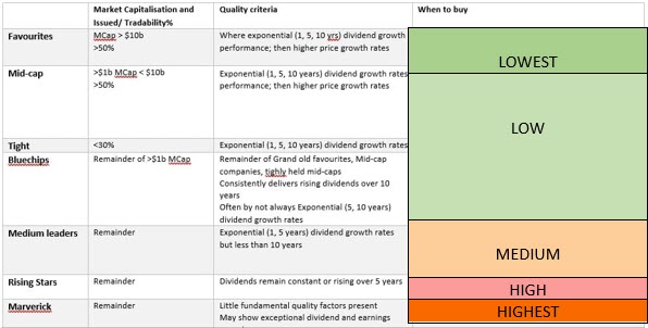
Risk & Return. Here, we want to see which groups offer the highest return with the least risk. To be expected, in order, Favourites, then Midcaps and then the Bluechips group. Observe the value difference between Favourites and Midcaps. More important are the groups, with the highest return at the highest risk. As expected, these are Maverick, Rising Stars, and Tightly groups. I have added a risk rating across the grouping in the table attached.
In summary
The Favourite group offers the highest return at the lowest risk, but offers the highest 5year dividend growth and highest 10 year price growth with the least market volatility. Thus, these shares are for investors that prefer consistent dividend income.
Your portfolio should consist of shares across the groups to form a balanced portfolio, with shares that provide price growth, dividend growth and balanced risk.
1. If you need high income growth you will select fewer shares in your portfolio and have, for example: 1x Favourites + 1x Tightly + 2x Bluechips + 2x Rising starts + 1 Maverick
2. If you need high dividend growth you will select more shares in your portfolio and have, for example: 3x Favourites + 2x Tightly + 3x Bluechips + 2x Rising starts
The best way is to print the table and mark it up to observe the patterns.
Different economies
By looking at the averages in the groups across different world economies, we observed different phenomena. The NASDAQ market, which consists primarily of high-tech companies, will have a much higher volatility and risk than the ASX.


